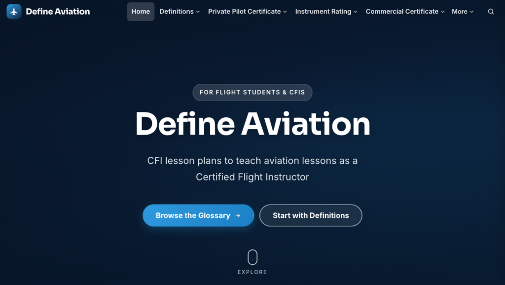
If you haven’t been by the site in a while, you’re in for a surprise — Define Aviation just got a full redesign. The old layout worked fine, but it wasn’t doing the content justice. The new one is built around the deep navy and sky-blue look you see now, with cleaner navigation and a layout that actually holds up on a phone between lessons.
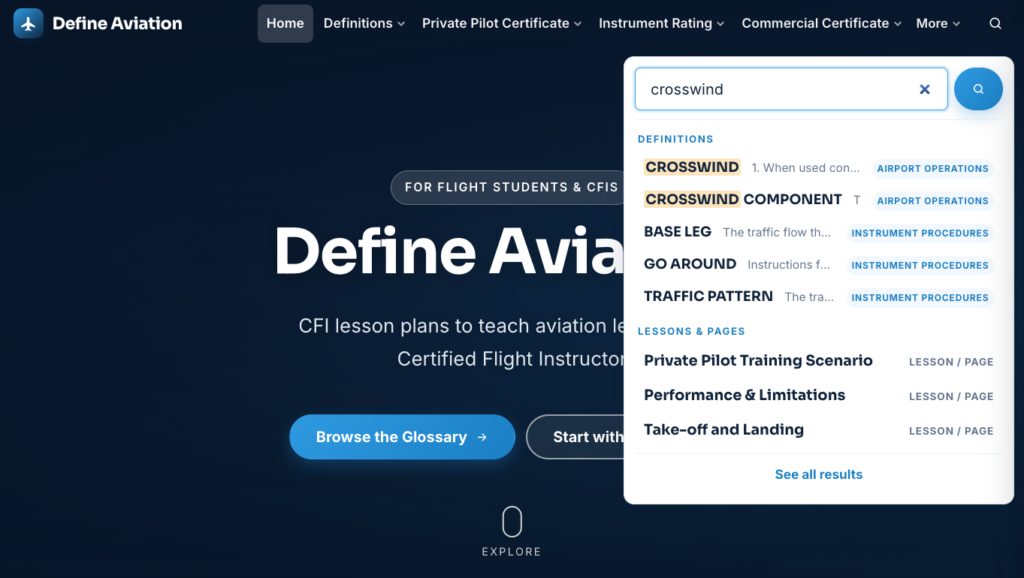
The biggest functional change is the search bar. Click the magnifying glass in the header and start typing, and results now appear instantly as you go. It searches everywhere at once — lesson plans, pages, and every term in the glossary — and ranks the closest match first. Type “crosswind,” for example, and the CROSSWIND and CROSSWIND COMPONENT definitions come up right alongside the matching lesson pages.
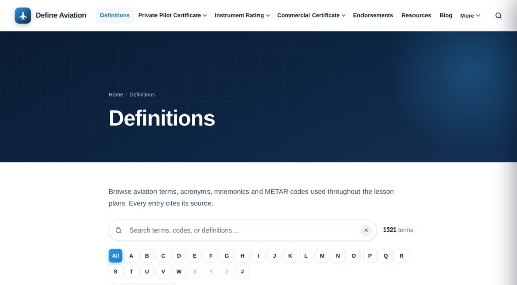
That search leans hard on the glossary, which has grown quite a bit too — it’s now over 1,300 terms. It’s organized with an A–Z index and category filters so you can browse instead of guess, and every entry still cites its source, same as always. Whether you’re prepping a lesson plan or double-checking a definition mid-review, it should be faster to find what you’re after now.
Poke around and let me know if anything looks off — still smoothing out a few corners.